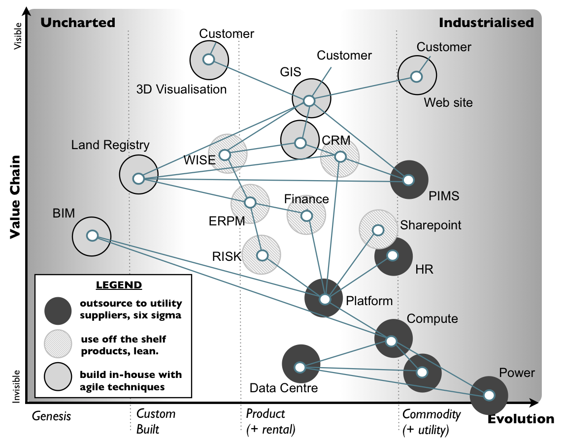
At a work event last week, I was pleased to see a slot about Wardley Maps, a technique that I’ve been reading about for a while. Wardley Maps can be used to help understand systems in a different way than just as boxes linked with lines, by including x/y axes to position each component based on its evolution and position in the value chain.
This allows a better visualisation of the makeup of they system and in particular which bits are novel and well suited to agile, and which are commoditised where a waterfall or ‘as as Service’ approach may suit better. The primary intention is for companies engaged in strategic play to consider how their product compares with competitors to then plan competitive moves, understanding the points are where they are more commodified than the competition and can attack on pricing, or open source something to disrupt the market etc. but in generally its a useful tool for understanding the landscape.
These maps have been pioneered by Simon Wardley and are being enthusiastically adopted by organisations including GDS. They are often known as Wardley Maps.
Simon’s blog is a very interesting read. A few posts for further reading:
- Why use maps
- This is a good overview of the variety of techniques that Simon proposes
- What is a Wardley Map (the embedded presentation is good)
As an aside he is quite impressed with IBM’s recent strategic play
And here’s a couple of example Wardley Maps to be going on with:

